Common Seaborn Interview Questions for Data Scientists
Seaborn is a powerful Python visualization library built on top of Matplotlib. It provides a high-level interface for drawing attractive and informative statistical graphics. Below are some frequently asked Seaborn interview questions along with explanations and code examples.
1. What is Seaborn, and how does it differ from Matplotlib?
Seaborn is a statistical data visualization library in Python that makes it easier to create visually appealing and complex plots. It is built on top of Matplotlib and is closely integrated with Pandas.
Key Differences from Matplotlib:
- Simpler Syntax: Seaborn provides easier functions for statistical plots.
- Built-in Themes: Seaborn includes default color themes and styles.
- Integrated with Pandas: Works seamlessly with Pandas DataFrames.
- Statistical Functions: Built-in statistical estimation and aggregation functions.
Example:
import seaborn as sns
import matplotlib.pyplot as plt
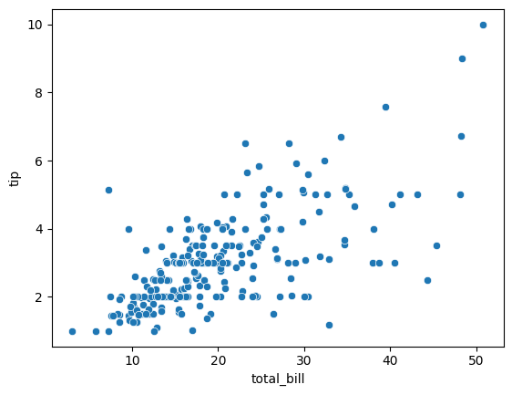
data = sns.load_dataset("tips")
sns.scatterplot(x="total_bill", y="tip", data=data)
plt.show()
Output:
2. How do you install and import Seaborn?
To install Seaborn, use:
pip install seaborn
To import and use Seaborn:
import seaborn as sns
import matplotlib.pyplot as plt
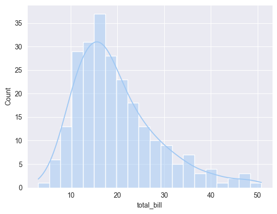
3. What are Seaborn's built-in themes, and how do you change them?
Seaborn provides different themes for styling plots.
Available themes:
darkgrid (default)whitegriddarkwhiteticksExample:
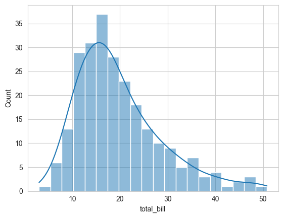
sns.set_style("whitegrid")
sns.histplot(data["total_bill"], bins=20, kde=True)
plt.show()
Output:
4. How do you create different types of plots in Seaborn?
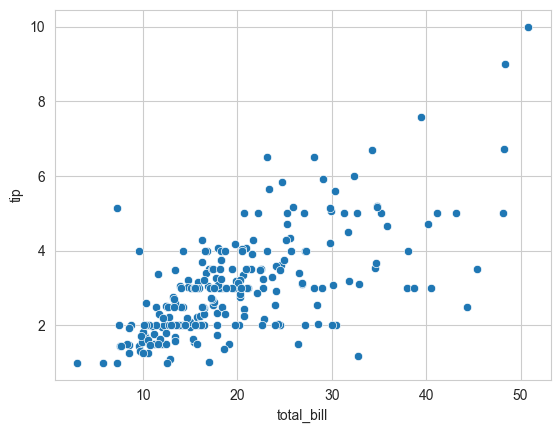
Scatter Plot:
sns.scatterplot(x="total_bill", y="tip", data=data)
plt.show()
Output:
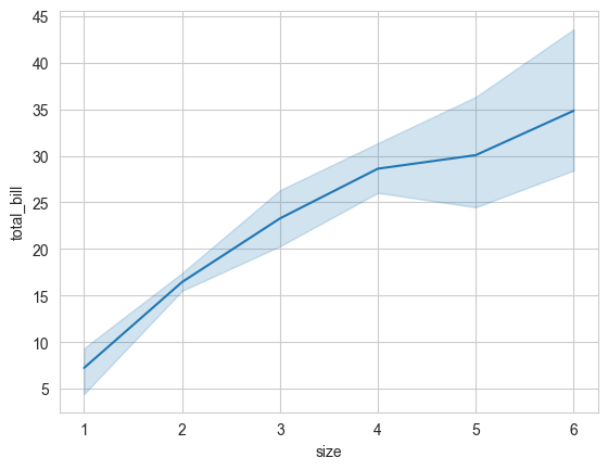
Line Plot:
sns.lineplot(x="size", y="total_bill", data=data)
plt.show()
Output:
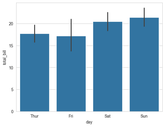
Bar Plot:
sns.barplot(x="day", y="total_bill", data=data)
plt.show()
Output:
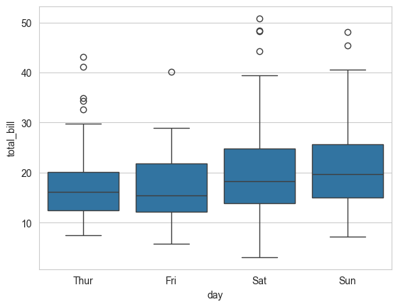
Box Plot:
sns.boxplot(x="day", y="total_bill", data=data)
plt.show()
Violin Plot:
sns.violinplot(x="day", y="total_bill", data=data)
plt.show()
Output:
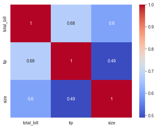
Heatmap:
import numpy as np
corr = data.corr()
sns.heatmap(corr, annot=True, cmap="coolwarm")
plt.show()
Output:
5. How do you customize Seaborn plots?
You can modify plot styles using sns.set(), sns.set_style(), and sns.set_palette().
Example:
sns.set_style("darkgrid")
sns.set_palette("pastel")
sns.scatterplot(x="total_bill", y="tip", hue="day", data=data)
plt.show()
Output:
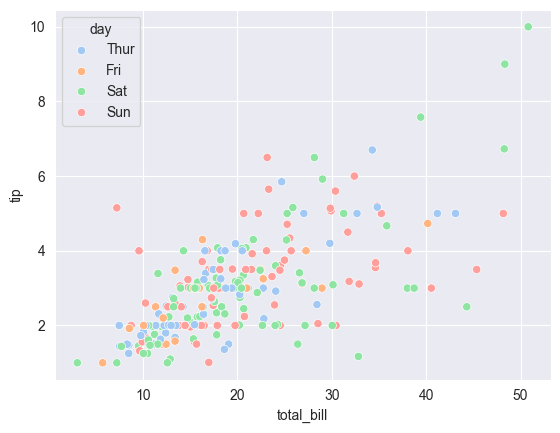
6. What is a pairplot, and how is it useful?
A pairplot creates scatter plots for all numerical variables in a dataset.
Example:
sns.pairplot(data, hue="day")
plt.show()
Output:
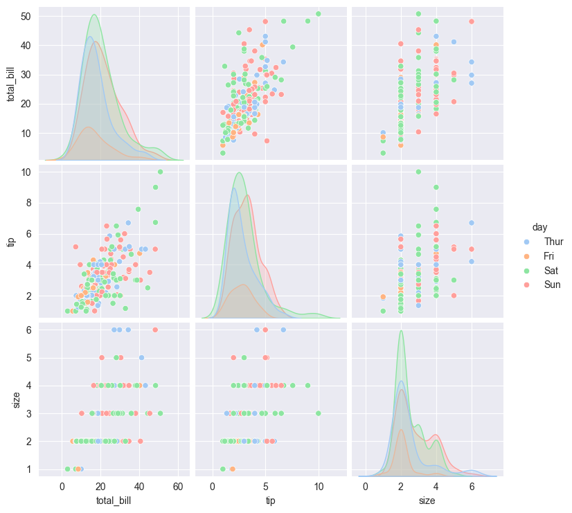
This is useful for identifying relationships and correlations between variables.
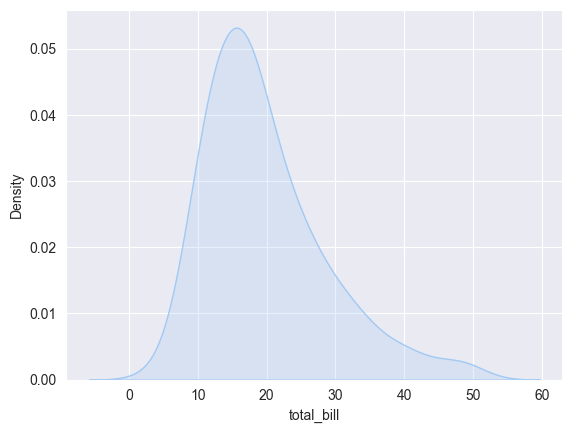
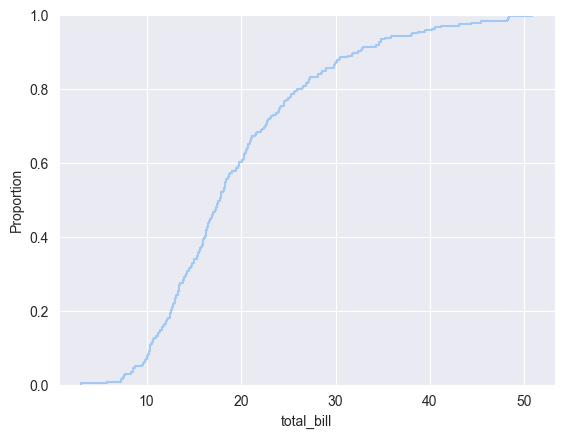
7. How do you visualize distributions in Seaborn?
Histogram with KDE:
sns.histplot(data["total_bill"], kde=True, bins=20)
plt.show()
Output:
KDE Plot:
sns.kdeplot(data["total_bill"], fill=True)
plt.show()
Output:
ECDF Plot:
sns.ecdfplot(data["total_bill"])
plt.show()
Output:
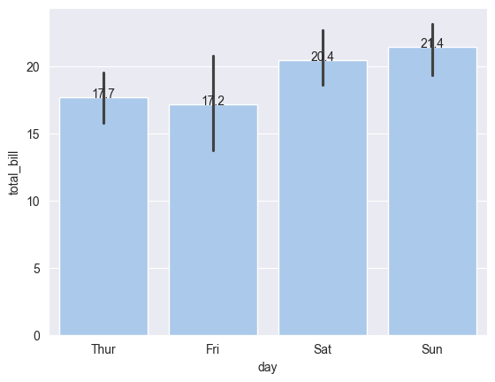
8. How do you add annotations to a Seaborn plot?
Example:
ax = sns.barplot(x="day", y="total_bill", data=data)
for p in ax.patches:
    ax.annotate(f'{p.get_height():.1f}', (p.get_x() + p.get_width() / 2, p.get_height()), ha='center')
plt.show()
Output:
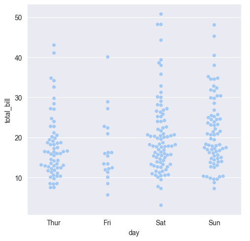
9. How do you use categorical plots in Seaborn?
Seaborn provides multiple functions for categorical plots:
sns.catplot() (general categorical plot function)sns.swarmplot() (displays all points in a category)Example:
sns.catplot(x="day", y="total_bill", kind="swarm", data=data)
plt.show()
Output:
Conclusion
Seaborn simplifies the process of creating beautiful and informative visualizations for data analysis. Mastering Seaborn will help data scientists effectively communicate insights from data.
This guide covered common Seaborn interview questions with examples. Keep practicing different types of visualizations to improve your data visualization skills!
Tags: Data Science, Data Science Basics, Data Scientist Interview, Data Scientist Interview Questions, Interview Preparation, Interview Questions, Machine Learning Interview, Seaborn


