Common Matplotlib Interview Questions for Data Scientists
Matplotlib is one of the most widely used Python libraries for data visualization. It provides extensive functionalities for creating static, animated, and interactive visualizations. Below are some frequently asked Matplotlib interview questions along with detailed explanations and code examples.
1. What is Matplotlib, and why is it used?
Matplotlib is a plotting library in Python that allows users to create a wide variety of static, animated, and interactive visualizations. It is particularly useful for data analysis and scientific computing.
Key Features:
- Highly customizable
- Works well with NumPy and Pandas
- Supports multiple backends
- Provides low-level control over plots
Example:
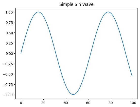
import matplotlib.pyplot as plt
import numpy as np

y = np.sin(np.linspace(0, 10, 100))
plt.plot(y)
plt.title("Simple Sin Wave")
plt.show()
Output:
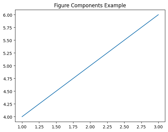
2. What are the key components of a Matplotlib figure?
A Matplotlib figure consists of several components:
- Figure: The overall container for the plot.
- Axes: The area where data is plotted.
- Axis: The x- and y-axis of a plot.
- Ticks: The markers along the axes.
- Legend: A label for different elements in a plot.
Example:
fig, ax = plt.subplots()
ax.plot([1, 2, 3], [4, 5, 6])
ax.set_title("Figure Components Example")
plt.show()
Output:
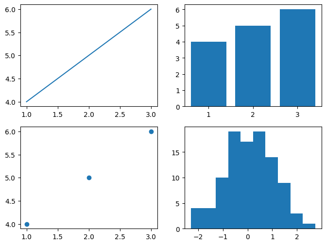
3. How do you create multiple subplots in Matplotlib?
You can use plt.subplots() to create multiple subplots within a single figure.
Example:
fig, axes = plt.subplots(2, 2, figsize=(8, 6))
axes[0, 0].plot([1, 2, 3], [4, 5, 6])
axes[0, 1].bar([1, 2, 3], [4, 5, 6])
axes[1, 0].scatter([1, 2, 3], [4, 5, 6])
axes[1, 1].hist(np.random.randn(100))
plt.show()
Output:
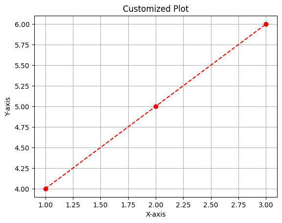
4. How do you customize plots in Matplotlib?
You can customize plots using labels, colors, and styles.
Example:
plt.plot([1, 2, 3], [4, 5, 6], linestyle='--', color='r', marker='o')
plt.xlabel("X-axis")
plt.ylabel("Y-axis")
plt.title("Customized Plot")
plt.grid(True)
plt.show()
Output:
5. How do you add a legend to a Matplotlib plot?
Use plt.legend() to add a legend.
Example:
plt.plot([1, 2, 3], [4, 5, 6], label="Line 1")
plt.plot([1, 2, 3], [6, 5, 4], label="Line 2")
plt.legend()
plt.show()
Output:
6. How do you create different types of plots in Matplotlib?
Line Plot:
plt.plot([1, 2, 3], [4, 5, 6])
plt.show()
Output:
Bar Chart:
plt.bar([1, 2, 3], [4, 5, 6])
plt.show()
Output:
Scatter Plot:
plt.scatter([1, 2, 3], [4, 5, 6])
plt.show()
Output:
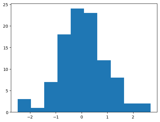
Histogram:
plt.hist(np.random.randn(100))
plt.show()
Output:
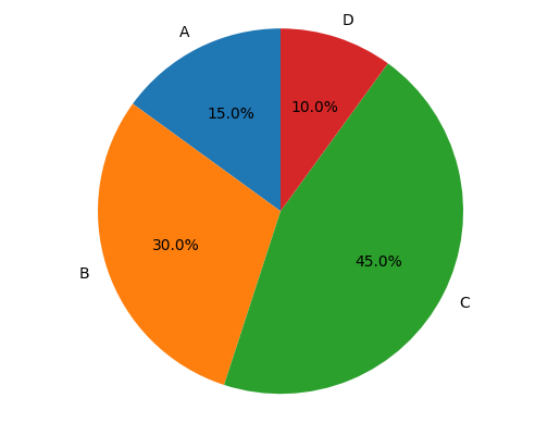
Pie Chart:
labels = ['A', 'B', 'C', 'D']
sizes = [15, 30, 45, 10]
plt.pie(sizes, labels=labels, autopct='%1.1f%%', startangle=90)
plt.axis('equal')  # Equal aspect ratio ensures the pie is circular.
plt.show()
Output:
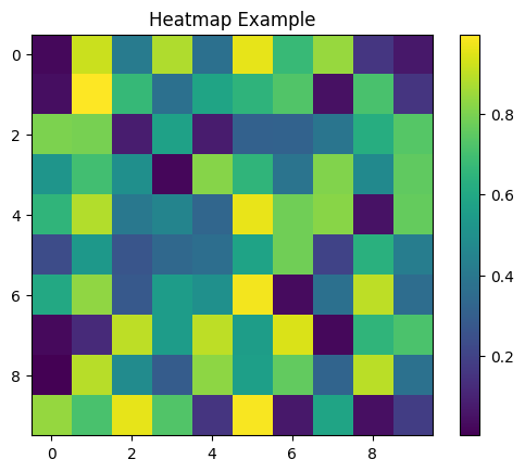
Heatmap using imshow():
data = np.random.rand(10, 10)
plt.imshow(data, cmap='viridis', interpolation='nearest')
plt.colorbar()
plt.title("Heatmap Example")
plt.show()
Output:
7. How do you create an interactive plot in Matplotlib?
Matplotlib supports interactivity through %matplotlib notebook or by using widgets.
Example:
plt.ion()  # Turn on interactive mode
x = np.linspace(0, 10, 100)
y = np.sin(x)
plt.plot(x, y)
plt.show()
If using Jupyter Notebook, enable interactive plots with:
%matplotlib inline
Conclusion
Mastering Matplotlib is essential for data visualization in Python. Understanding how to create, customize, and manipulate plots will greatly enhance your ability to analyze data efficiently.
This guide covered the most common Matplotlib interview questions with code examples. Keep practicing different types of visualizations to strengthen your skills!
Tags: Data Science, Data Science Basics, Data Scientist Interview, Data Scientist Interview Questions, Interview Preparation, Interview Questions, Machine Learning Interview, Matplotlib


